Fusion UI LogoFusion UI Logo
/
Getting Started
Concepts
Components
Example Apps
Getting Started
Concepts
Components
Example Apps
Fusion UI LogoFusion UI Logo
Getting Started
Concepts
Components
Example Apps
Overview
Actions
Button
Button Group
Segmented Button
Deprecated
Split Button
Toggle Button
Click To Copy
Toolbar
Navigation
Main Nav
Side Menu
Page Header
Tabs
Breadcrumbs
On-Page Menu
Link
Command Menu
Application Switcher
Context Switcher
Account Menu
Menu Bar
Deprecated
Inputs & Forms
Form
Form Actions
Deprecated
Form Divider
Form Field
Form Repeat
Form Spacing
Input
Prefix & Suffix
Rich Text Input
Autocomplete
Select
Date / Time Input
Calendar
Slider
Selection
Checkbox
Radio
Switch
Switch Select
Chip
Chip Choice
Chip Filter
Chip Input
Chip Sortable
Visual Select
Pricing Plan Select
Feedback & Loading
Banner
Inline Message
Snackbar
Inline Snackbar
Loading Spinner
Skeleton
Text Skeleton
Contextual Information
Badge
Status
Tag
Tooltip
Info
Hotkey
Icon
Icon Sizer
Containers & Overlays
Tile
Tile Content
Tile Footer
Tile Header
Annotated Section
Modal
Sheet
Popover
Context Menu
Data Display
Data Table
List
Timeline
Data Visualization
KPI Card
Ratio Card
Bar Chart
Line Chart
Pie Chart
Heatmap Calendar
Layout
Container
Stack Layout
Flow Layout
Internals
Blanket
Expansion Panel
Menu List Base
Menu Group
Search Bar

Components

Every component of Fusion UI, grouped by what it is for.

Each component page explains the usage with live examples and their code, lists the specs like the API, and gives guidelines on when to use the component and when another one fits better. To see how components work together, have a look at the example apps.

Actions

Let people start an action, commit a choice or copy something.

ButtonStarts an action, in different colors, styles and sizes, with optional icons.
Click To CopyCopies a value to the clipboard with a single click and confirms it.
ToolbarFloating bar with the actions for the current selection or focused element.

Navigation

Move between applications, pages and the sections of a page.
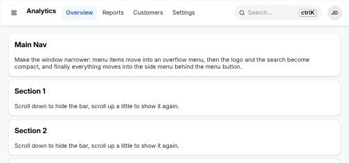
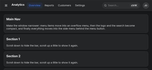
Main NavTop level navigation bar of an application with logo, menu and account.
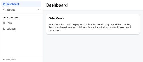
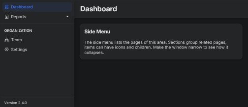
Side MenuVertical navigation for the sections of an area, collapsible on small screens.
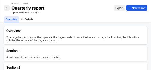
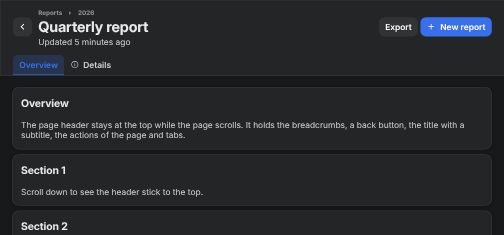
Page HeaderSticky header with title, breadcrumbs, actions and tabs of a page.
TabsSwitches between views of the same context without leaving the page.
BreadcrumbsShows where the current page sits in the hierarchy and leads back up.
On-Page MenuTable of contents of a long page that follows the scroll position.
LinkText that navigates to another page or resource.
Command MenuKeyboard first search for pages and actions, opened with ⌘K.
Application SwitcherJumps between the applications of a product family.
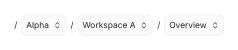
Context SwitcherSwitches the workspace, project or version all pages refer to.
Account MenuAvatar menu with the signed in account, its settings and sign out.
Menu Bar
Deprecated
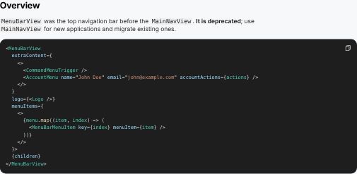
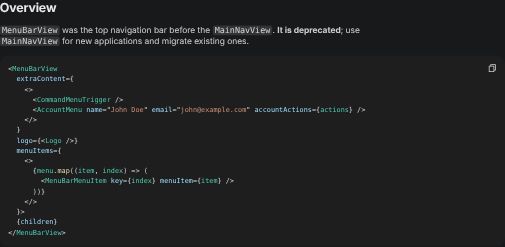
Former top navigation bar. Use Main Nav instead.

Inputs & Forms

Enter text, numbers and dates, and structure them into forms.
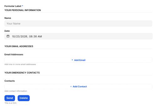
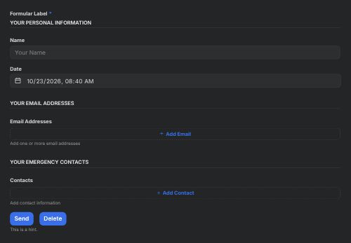
FormLays out fields, groups, repeated entries and the actions of a form.
InputSingle or multi line text field with label, hint and validation.
Rich Text InputText field with formatting like bold, lists and links.
AutocompleteText field that suggests matching values while typing.
SelectPicks one value from a list that opens on demand.
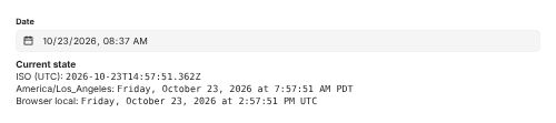
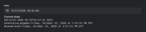
Date / Time InputEnters a date, a time or both, typed or picked from a calendar.
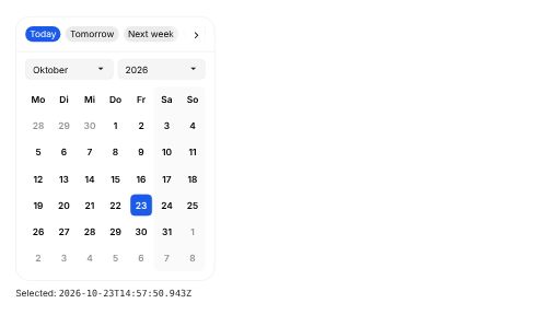
CalendarMonth view to pick a single date or a range.
SliderPicks a number or a range by dragging along a track.

Selection

Pick one or several options from a visible set.

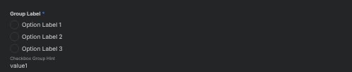
CheckboxTurns an option on or off, alone or as one of many.
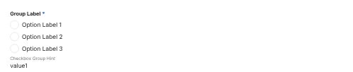
RadioPicks exactly one option from a small, visible set.
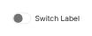
SwitchTurns a setting on or off with immediate effect.
Switch SelectSwitches between two to five always visible options, e.g. views or modes.
ChipCompact elements to filter, choose, sort or enter several values.
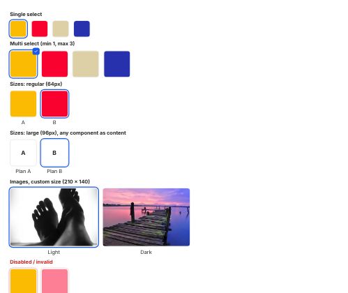
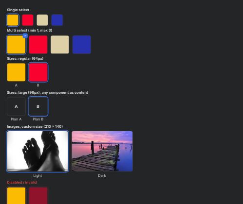
Visual SelectPicks an option that is best described by a picture.
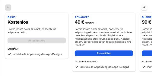
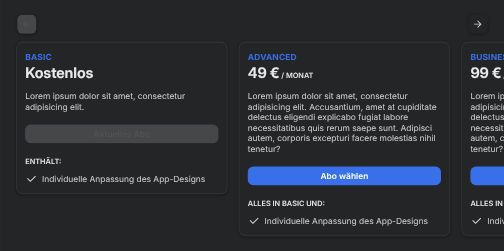
Pricing Plan SelectCompares plans side by side and picks one.

Feedback & Loading

Tell people what happened, what went wrong and that something is in progress.

BannerApplication wide message above all content, e.g. maintenance or trial end.
Inline MessagePersistent message within the content it is about.
SnackbarShort lived confirmation at the bottom of the screen, optionally with an action.
Inline SnackbarSmall confirmation right at the element that triggered it.
Loading SpinnerIndicates that something is loading when its shape is unknown.
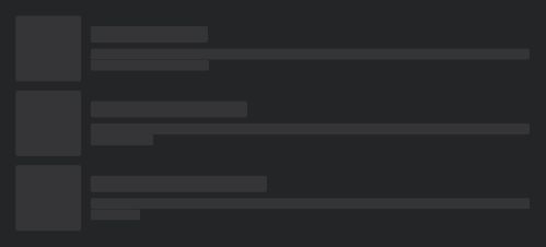
SkeletonPlaceholder in the shape of the content that is loading.

Contextual Information

Small labels, hints and symbols that add meaning to other content.

BadgeSmall counter or dot on another element, e.g. unread items.
StatusShows the state of an object with a color and a label.
TagLabel that categorizes content.
TooltipShort label that explains an element on hover or long press.
InfoInfo icon that reveals a longer explanation on hover or tap.
HotkeyShows a keyboard shortcut and optionally registers it.
IconThe icon set of Fusion UI and how to size icons.

Containers & Overlays

Surfaces that group content, on the page or above it.

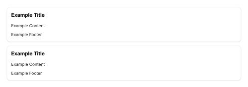
TileElevated surface that groups related content on a page.
Annotated SectionSection with a title and description next to its content, e.g. for settings.
ModalDialog above the page that needs a decision before continuing.
SheetPanel sliding in from the side for details or editing next to the page.
PopoverSmall floating surface anchored to the element that opened it.
Context MenuMenu of actions for an element, opened with a button or right click.

Data Display

Show collections of records as tables, lists and sequences.
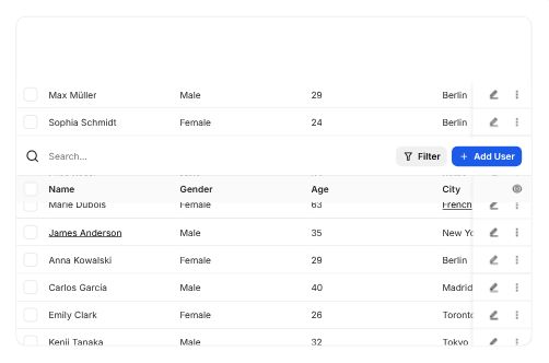
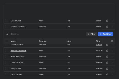
Data TableSortable, filterable and selectable table for large record sets.
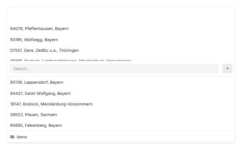
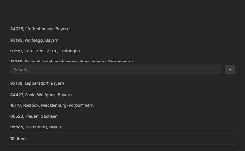
ListVertical list of records with search, selection and custom content.
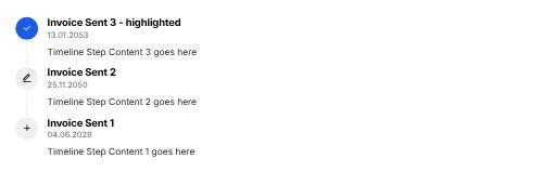
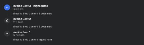
TimelineChronological sequence of events or steps.

Data Visualization

Charts and key figures that summarize numbers at a glance.

KPI CardA key figure with its trend.
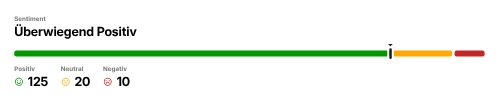
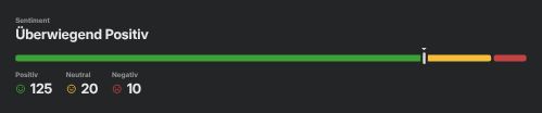
Ratio CardA part of a whole as figure and bar.
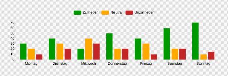
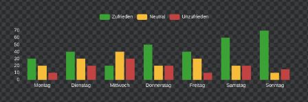
Bar ChartCompares values across categories.
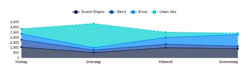
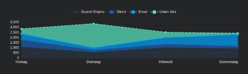
Line ChartShows how values develop over time.
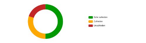
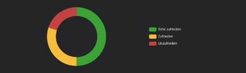
Pie ChartShows the shares of a whole.
Heatmap CalendarActivity per day over months as colored calendar cells.

Layout

Arrange content on the page with consistent widths and spacing.
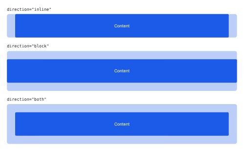
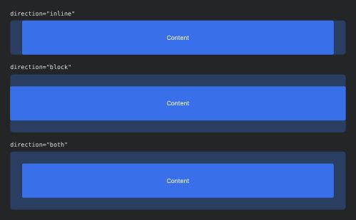
ContainerCenters content with the standard page width and padding.
Stack LayoutStacks elements vertically with consistent spacing.
Flow LayoutPlaces elements in a row and wraps them when space runs out.

Internals

Building blocks used by other components. Rarely needed directly.

BlanketDimmed backdrop behind modals and sheets.
Expansion PanelAnimates content open and closed.
Menu List BaseShared list of menu items behind menus, selects and command menu.
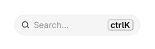
Search BarSearch field used by lists, tables and the command menu.
On this page
  • Actions
  • Navigation
  • Inputs & Forms
  • Selection
  • Feedback & Loading
  • Contextual Information
  • Containers & Overlays
  • Data Display
  • Data Visualization
  • Layout
  • Internals